Branding & Graphic Design
This project posed quite a challenge because, unlike most designs where we only need to satisfy one client, we had to balance the preferences and needs of two public companies simultaneously.
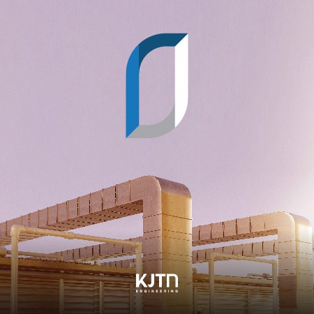
KJTN is a joint venture between KJTS, a Malaysian chilled-water system provider and TN Group, a comprehensive industrial goods conglomerate in Thailand. Their focus is on delivering turnkey installation and maintenance services for building chilled water systems in hotels, hospitals, and shopping malls.
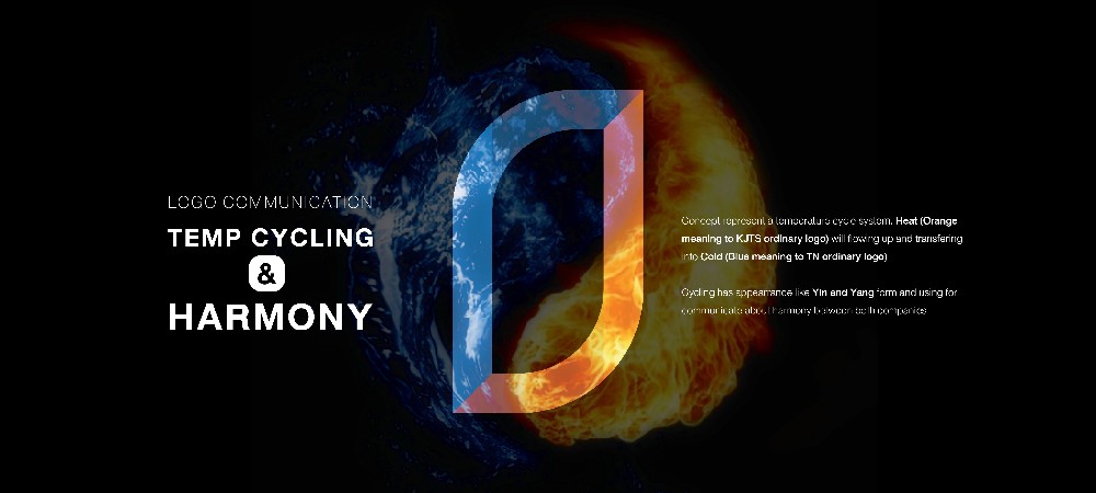
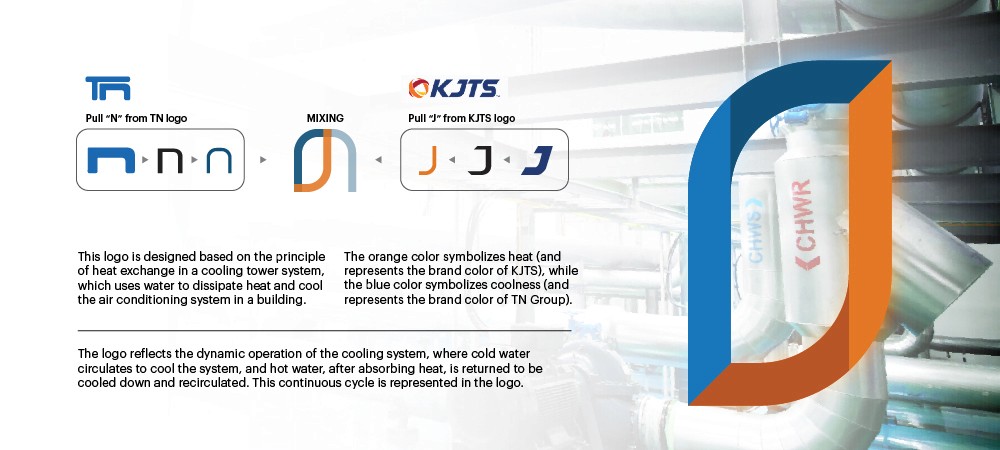
As a result, KJTN’s logo needed to convey the distinctive qualities of both KJTS and TN Group, while also reflecting the company’s core services. This led to the concept of “Temp Cycling,” where KJTS’s orange (representing heat) and TN Group’s blue (representing cold) come together symbolizing the role of chilled-water systems in cooling. The logo’s form is derived from the second letters of both company names (J from KJTS and N from TN Group), merged into a cohesive shape that highlights their collaboration.