Branding & Graphic Design
Simplicity in both function and design, that’s what Harumaru’s branding aims to communicate.
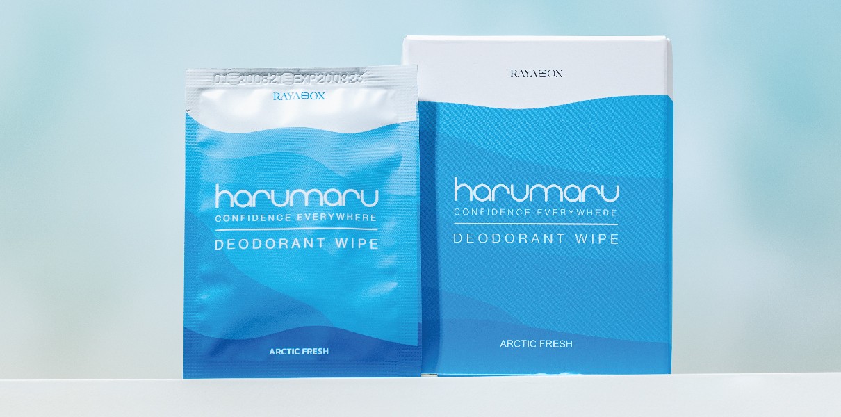
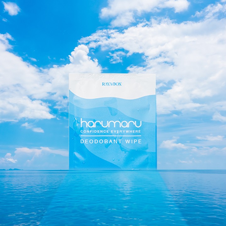
Harumaru’s signature product is a deodorant wipe, notable for its 3C benefits
Clean – Thoroughly cleans underarms and provides 24-hour odor protection.
Care – Moisturizes and nourishes the skin after wiping.
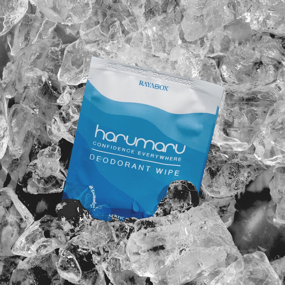
Cool – Leaves a refreshing feeling, as if you’ve just stepped out of the shower.
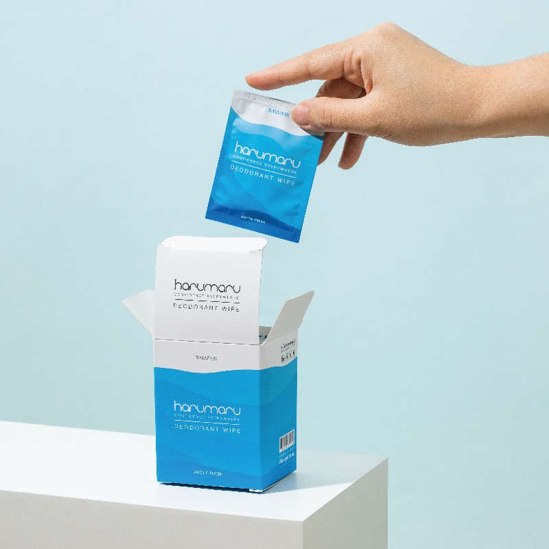
All these benefits come from three simple steps: tear the packet, wipe, and discard, which provides over 24 hours of odor protection.
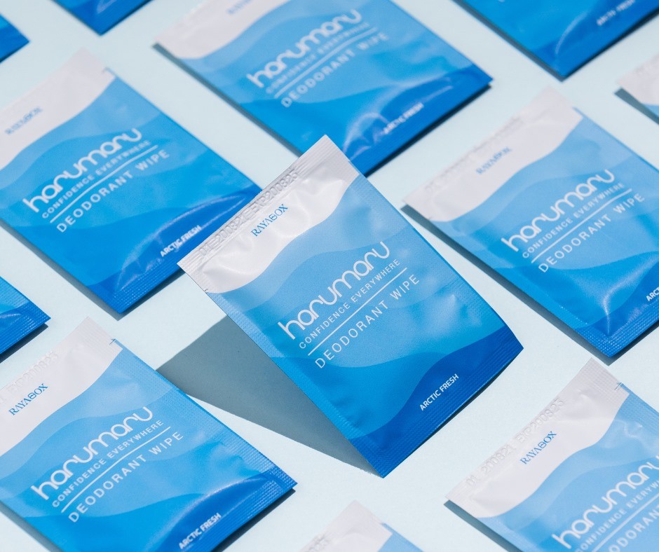
Because the product is straightforward to use, we wanted the Harumaru brand identity to reflect this simplicity while highlighting its 3C benefits. That’s why we chose a blue color palette, symbolizing lightness, freshness, cleanliness, and coolness, along with wave-like curves that evoke a sense of relaxation and chill.
All of these design choices ensure you’ll truly feel refreshed whenever you use the wipes after a workout, during a hot day when walking from place to place, or anytime you’d rather carry these wipes instead of a deodorant spray.